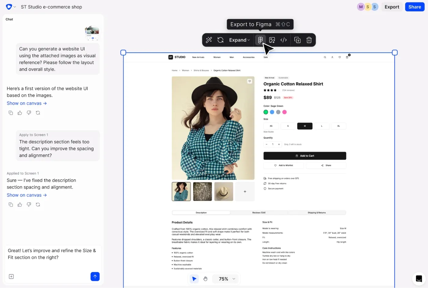
The Product Builder's Guide to Vibe Design (No Design Experience Needed)
Vibe design lets anyone turn a text prompt into real UI—no Figma skills required. Here's how it works, who it's for and how to use it to ship faster.
Tired of generic results? Here are the best AI design prompts for UI and UX work—with copy-paste examples, a simple formula, and tools that turn them into real designs.
You type "design a dashboard" into an AI tool. You get back something that looks like a PowerPoint slide from 2009, complete with a pie chart nobody asked for and a sidebar that no one will ever use.
So you try again. Same result, different shade of mediocre.
Before you start hating on AI, consider this: the fault is in the prompts.
Vague input produces vague output; it's almost a law of physics at this point. The difference between "AI gave me garbage" and "wow, look at this" is almost entirely about how well you described what you wanted. Well, that and the tool you use, too.
This article is for anyone, from a product manager to a junior designer, who wants to stop wasting time on AI-generated designs that they need to keep redoing. You'll get a formula for how to communicate with AI models, a full library of UI and UX design prompts you can copy into your AI UI design tool, and a clear sense of what to do with the design you get.
See also: Best tools for UI design
When you write a vague prompt, you're outsourcing all the creative work on the design ideas to the AI. A human UX designer would ask you ten clarifying questions before touching a file. AI doesn't. It fills the gaps with statistical averages, which is why everything looks like a slightly different version of the same generic SaaS dashboard.
"Design a login screen" could mean a consumer fintech app, a hospital patient portal, or a dev tool for engineers. Each of those has completely different user pain points, visual priorities and interaction patterns. Without context, the AI picks the safe (boring) option, which isn't the best fit for anyone.
There's also a workflow trap that influences result quality. Many teams prompt a language model to describe a UI in text, then manually translate it into a design. That's just wasted time on an additional step that produces translation errors and a robotic creative process. For better results, learn how to prompt a tool that outputs the actual visual.
You don't need a huge, detailed description to get a properly user-centered design. Just enough context to let AI know what it's doing. Luckily, there's a formula that gets you good, relevant results, and it's not that complicated. Four parts:
Visual style isn’t just about light vs. dark mode. You can (and should) specify things like:
Example:
"Clean, minimal UI with rounded buttons, soft shadows and a modern sans-serif font"
Here's what the formula looks like compared to prompts that get you nowhere.
If your prompt is too broad, AI will change things you didn’t ask for.
The fix is simple: name the exact element and where it lives.
Bad:
"Make the button better"
Good:
"Increase the size of the primary CTA button on the sign-up screen and change it to a solid blue"
Even better:
"On the sign-up screen, make the primary CTA button full-width, increase padding, and use the brand’s primary blue"
Always anchor your change:
Before you hit enter, check if your prompt includes:
If you're missing one of these, your result will probably feel generic.
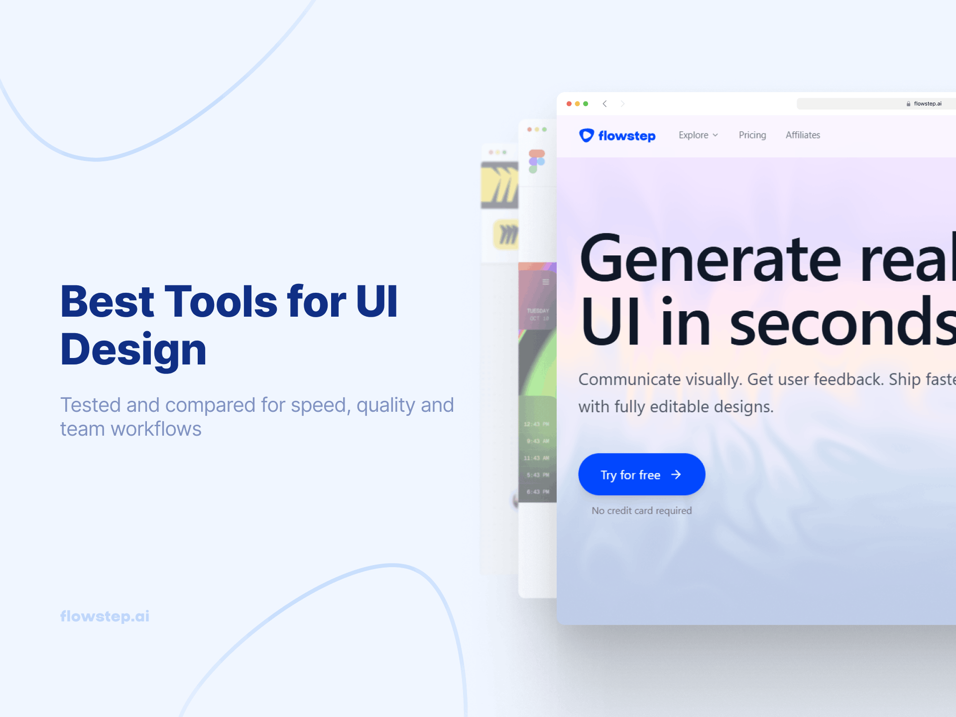
These prompts are written for tools that generate actual visual UI. Running them in Flowstep, which generates polished, easily editable interfaces, takes seconds. Most importantly, you don't need to know UX design terminology to use them or write your own.
One more thing worth knowing before you dive in: Flowstep can generate multiple visual directions of your project from a single prompt. That makes it a great tool for early-stage ideation, when you don't know exactly what you want but you'll recognize it when you see it. Several of the prompts below are written specifically to take advantage of that—prompting for variety rather than one definitive answer. In other words, good prompts don't always have to be singular.
Onboarding is where most products lose users, yet it's also where the UX process tends to get rushed. The prompts for this stage benefit from specificity because you want to design a sequence with logic.
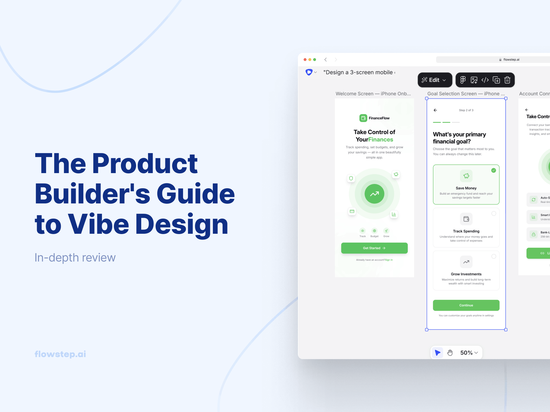
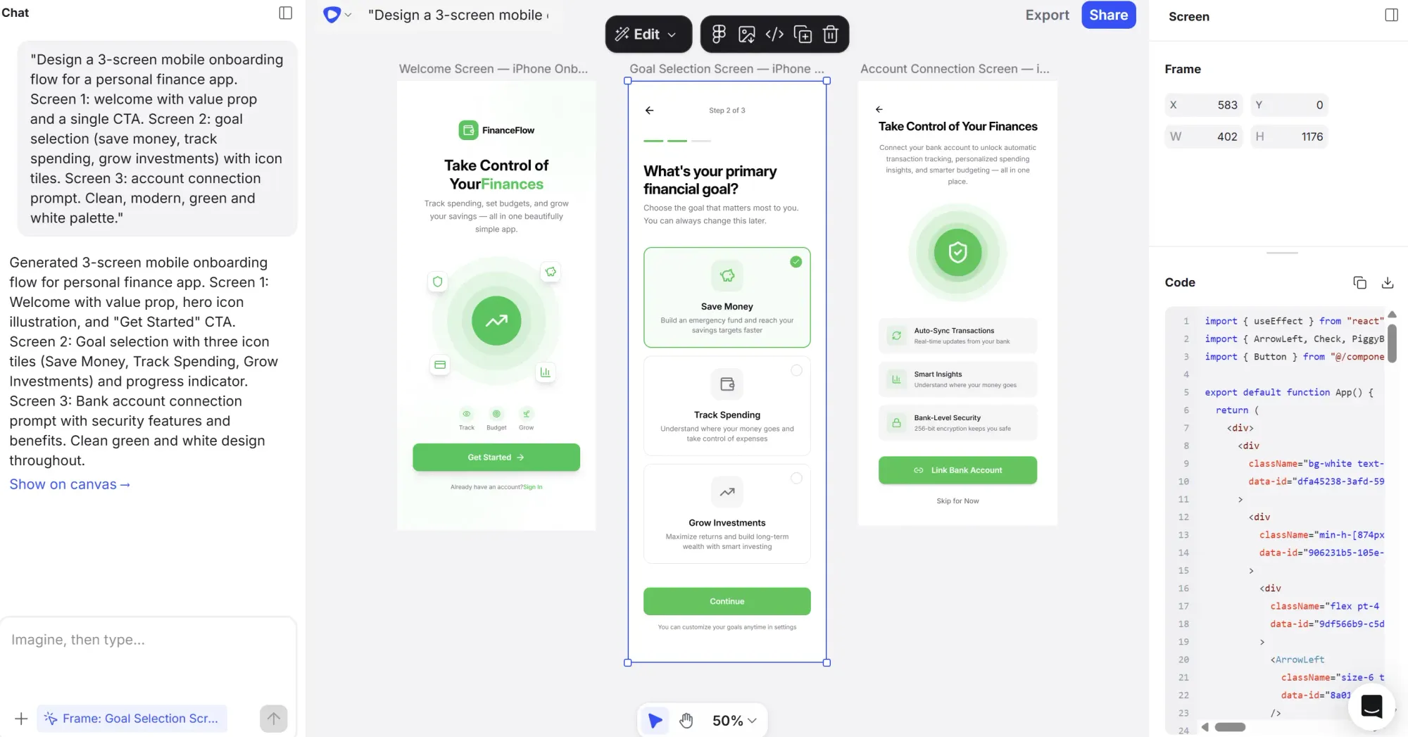
Prompt 1:
"Design a 3-screen mobile onboarding flow for a personal finance app. Screen 1: welcome with value prop and a single CTA. Screen 2: goal selection (save money, track spending, grow investments) with icon tiles. Screen 3: account connection prompt. Clean, modern, green and white palette."
Prompt 2:
"Design a web sign-up flow for a B2B project management tool targeting ops teams. Step 1: email and password, Step 2: company size and role selection, Step 3: invite teammates. Progress indicator at the top. Clean, minimal, blue and white."
Prompt 3:
"Generate three different welcome screen directions for a language learning app targeting adults. One playful, one minimal, one bold. Mobile format."
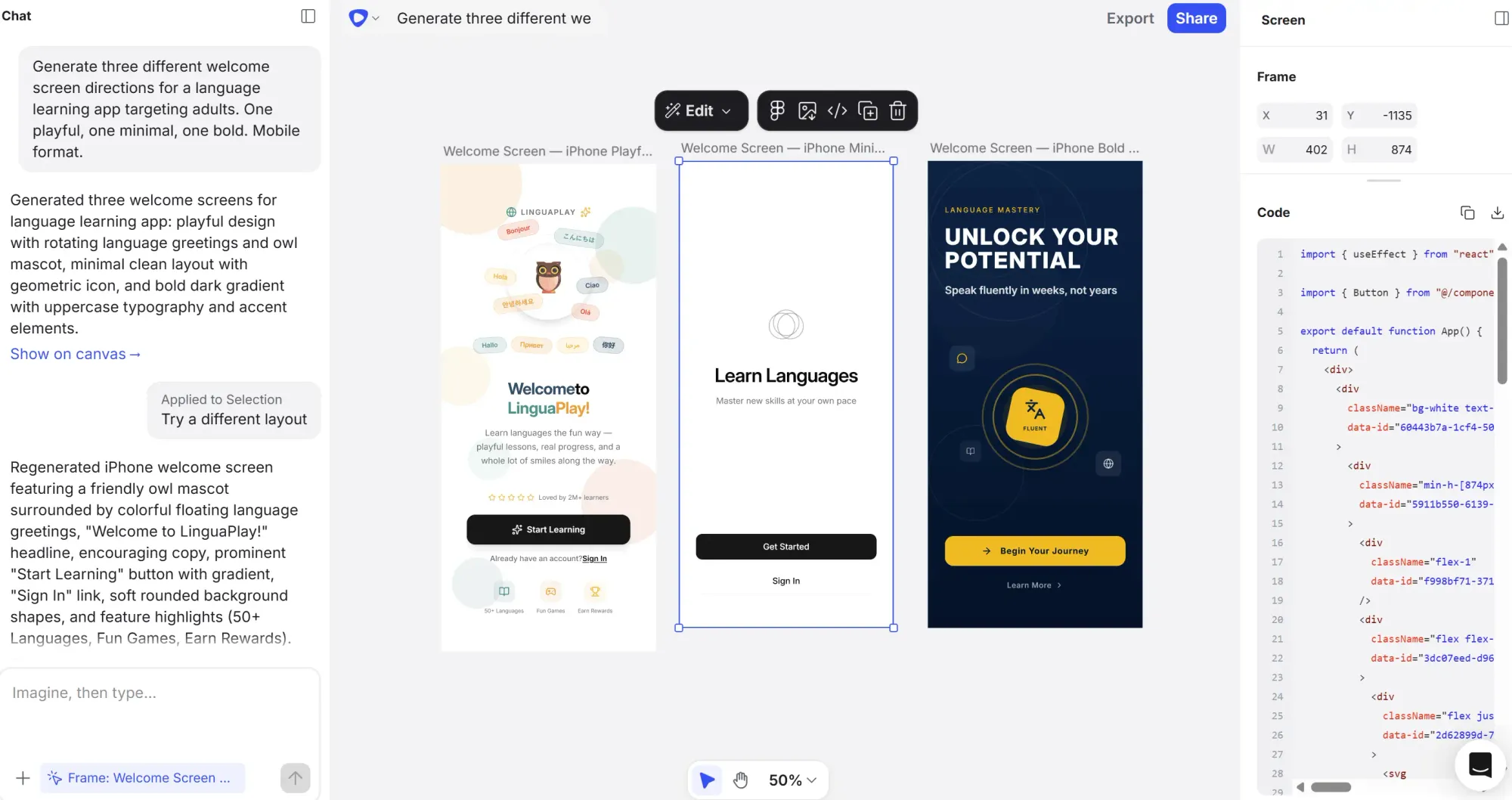
That third one leans into Flowstep's multi-output capability, so you're sparking creativity in your brainstorming process with drastically different visuals.
Dashboards are hard to start from scratch. There's a lot of data and no obvious hierarchy. Good prompts here do the job of the initial design brief—to specify what the user needs to see first.
Prompt 1:
"Design a project management dashboard for a startup team of 5–10 people. Show active sprints, task completion rate, overdue items and team workload. Top navigation, sidebar for projects, card-based main area. Light mode, clean and professional."
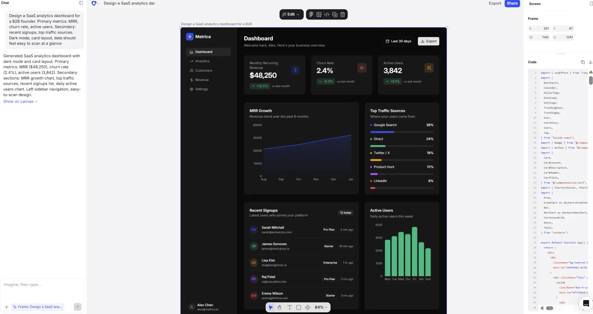
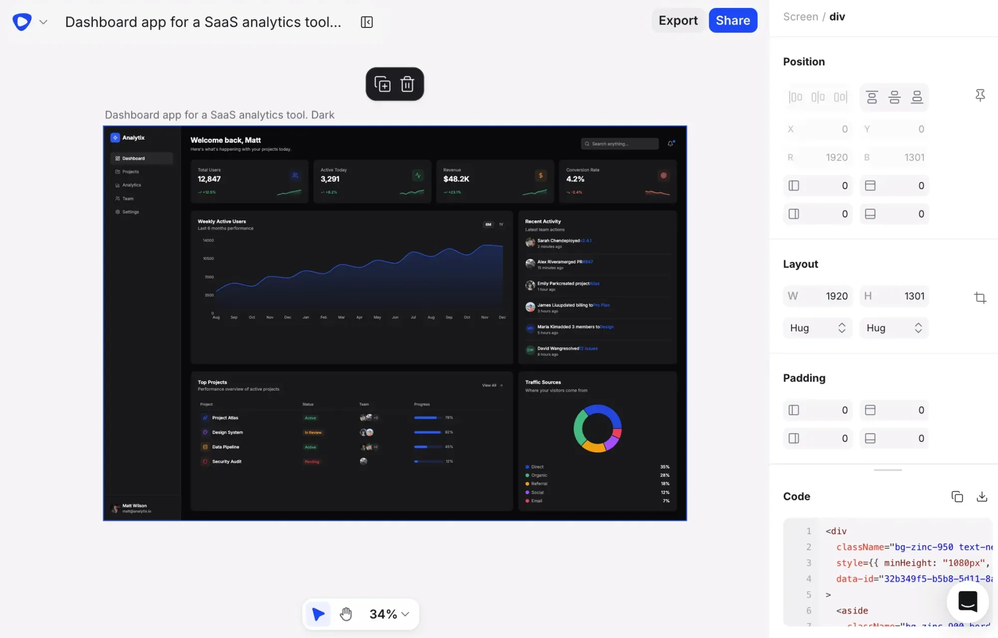
Prompt 2:
"Design a SaaS analytics dashboard for a B2B founder. Primary metrics: MRR, churn rate, active users. Secondary: recent signups, top traffic sources. Dark mode, card layout, data should feel easy to scan at a glance."
Prompt 3:
"Design an e-commerce operations dashboard for a DTC brand. Daily orders, revenue, return rate, top products. Mobile-responsive, light mode, simple chart visualizations."
Product teams need to mock up landing pages fast—to test messaging, communicate a new feature internally, or walk investors through a project before anyone writes a single line of code. These prompts work best when they carry the product's core value proposition, not just a layout description.
Prompt 1:
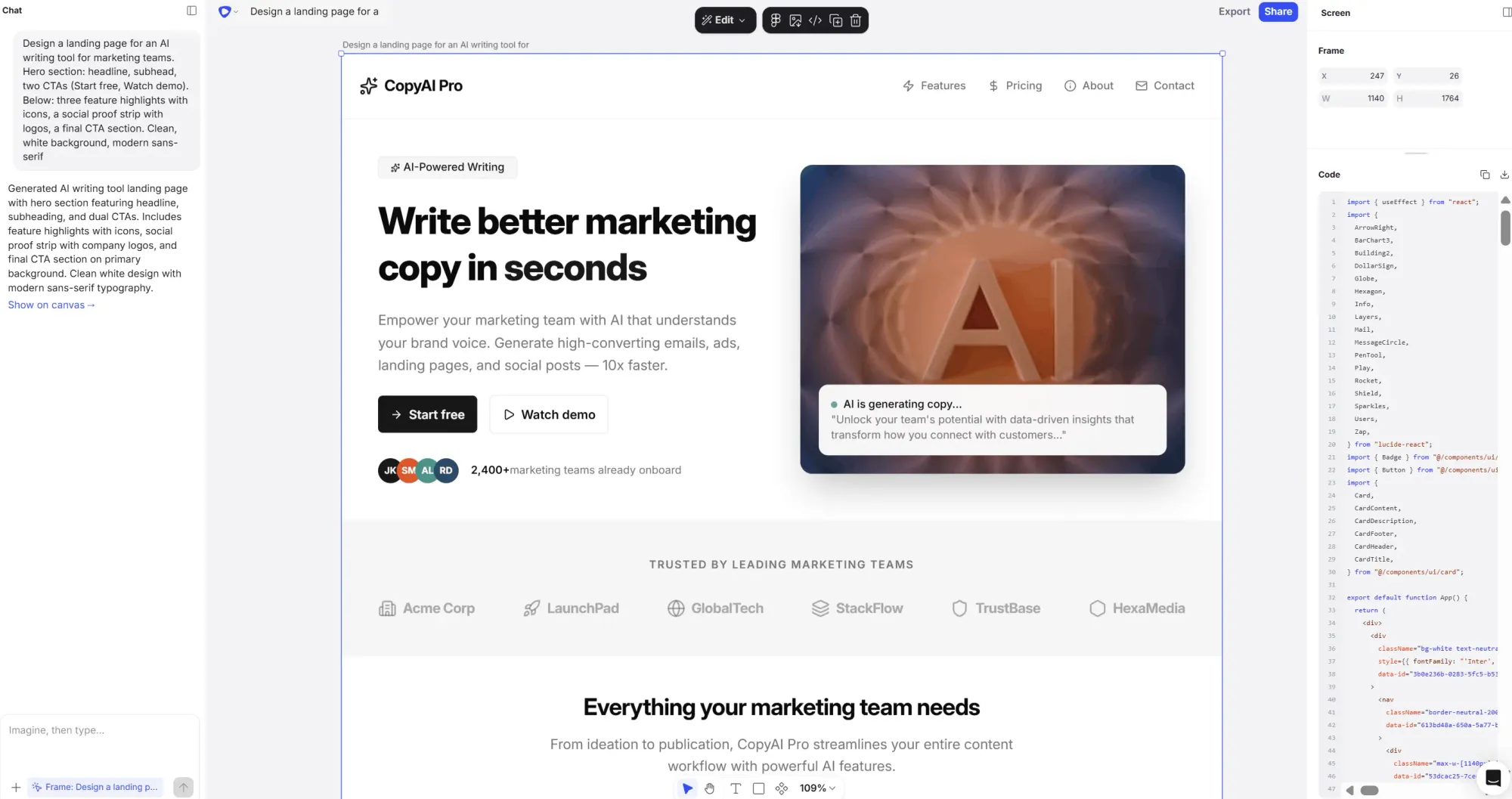
"Design a landing page for an AI writing tool for marketing teams. Hero section: headline, subhead, two CTAs (Start free, Watch demo). Below: three feature highlights with icons, a social proof strip with logos, a final CTA section. Clean, white background, modern sans-serif."
Prompt 2:
"Design a feature announcement page for a B2B SaaS product launching an AI reporting feature. Short headline, product screenshot area, bullet point benefits, one CTA. Professional, blue accent color."
Prompt 3:
"Generate two landing page directions for a no-code form builder: one minimal and conversion-focused, one richer with illustrations and testimonials."
One thing that changes these prompts considerably: attaching a PRD or linking brand guidelines for reference. Flowstep supports this natively, so instead of describing your brand and product from scratch every time, you can give the AI actual context with two clicks. Check out our guide on how to use AI in design if you want to go deeper.
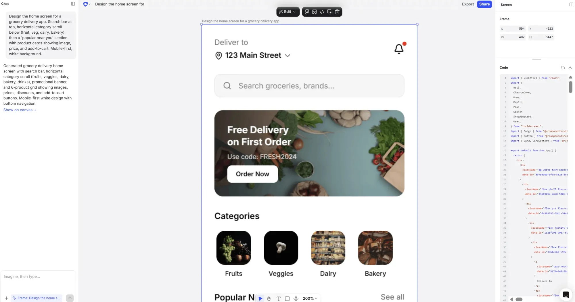
Mobile prompts need to account for smaller real estate and different navigation patterns—these details matter a lot in the output. State the format explicitly. Call out interaction patterns where they affect layout. And if you're designing something like a fitness app or a food delivery screen, describe the user's task, not just the screen name.
Prompt 1:
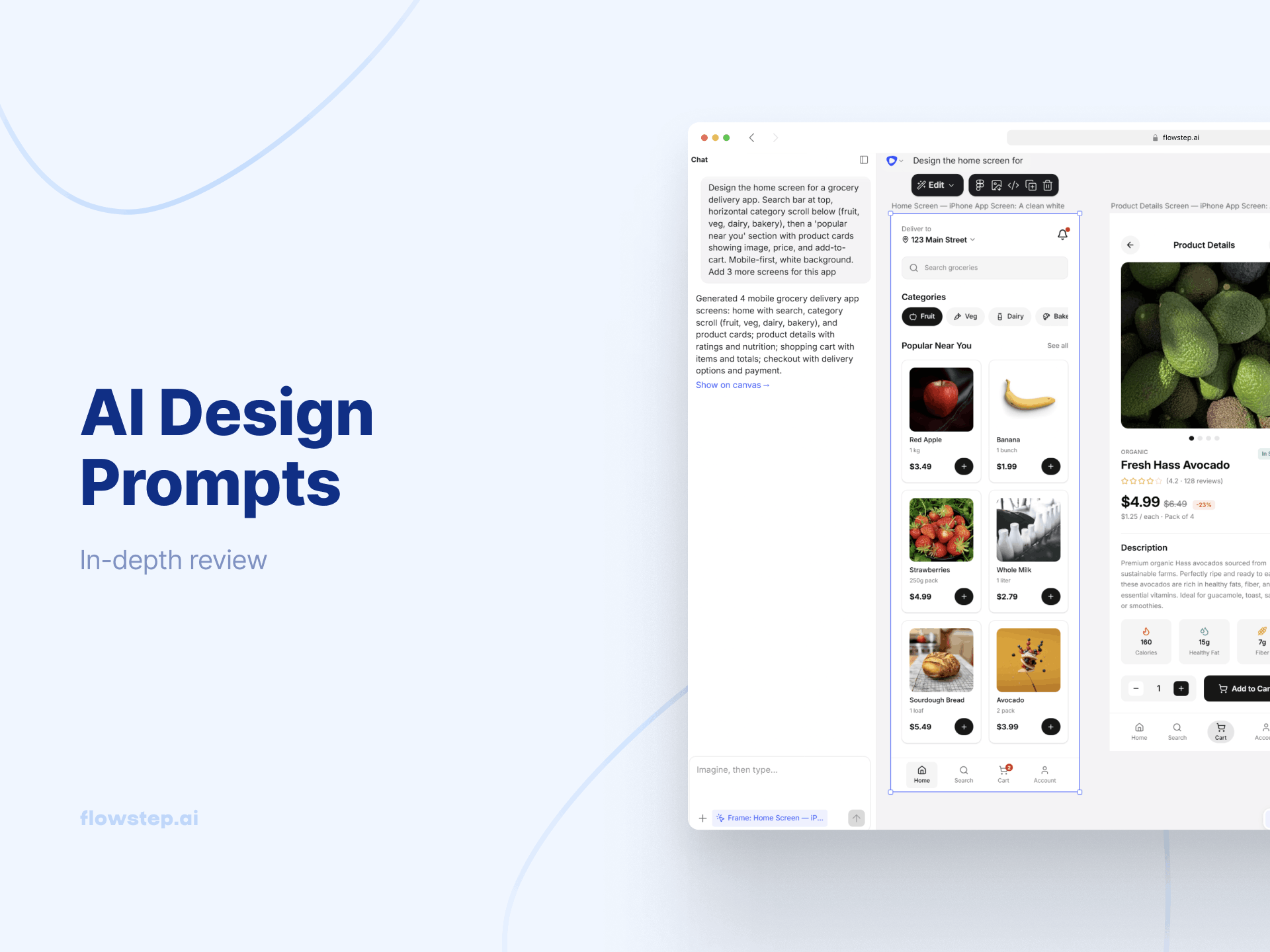
"Design the home screen for a grocery delivery app. Search bar at top, horizontal category scroll below (fruit, veg, dairy, bakery), then a 'popular near you' section with product cards showing image, price, and add-to-cart. Mobile-first, white background."
Prompt 2:
"Design the workout log screen for a fitness app targeting casual runners. Today's run summary (distance, pace, time), weekly progress bar, quick-log button. Bottom navigation. Clean, dark mode, motivational tone."
Prompt 3:
"Design the booking confirmation screen for a ride-sharing app. Driver name and photo, car details, ETA, map placeholder, cancel option. Mobile, minimal, white and black."
Nobody writes prompts for settings pages when brainstorming product designs. And then suddenly you need twelve of them. These screens also tend to require the closest alignment to an existing design system, which is exactly why attaching a reference screenshot before you generate makes a meaningful difference.
Prompt 1:
"Design a user profile settings page for a B2B SaaS tool. Sections: personal info, password and security, notification preferences, connected integrations. Sidebar navigation, desktop web, clean enterprise style."
Prompt 2:
"Design a notification settings screen for a mobile productivity app. Toggle switches for notification types (reminders, mentions, updates), grouped by category. Mobile, minimal, light mode."
Prompt 3:
"Design a billing page for a SaaS tool. Current plan, usage meter, next billing date, payment method on file, upgrade CTA. Desktop, clean, card-based."
Most prompt guides cover single screens. That's fine for exploration, but product teams building real things need flows—a connected sequence of screens that tells a complete story from entry point to first meaningful action.
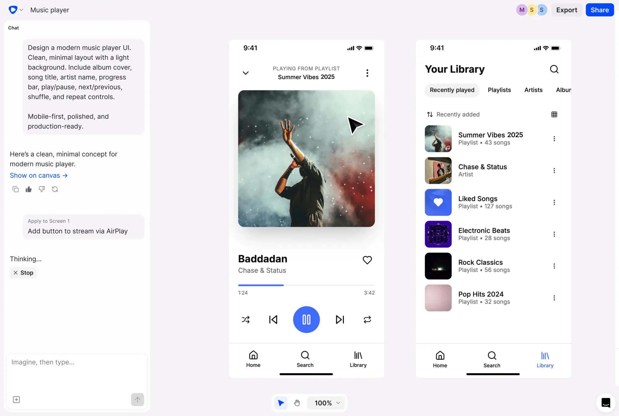
The good news is you can prompt for a full flow in a single go. Describe the experience end-to-end. Flowstep handles multi-screen generation on an infinite, easily editable canvas, so you're not re-prompting for each screen individually.
Prompt 1:
"Design a 4-screen user flow for a project management tool: 1) Login with email/password and SSO, 2) Empty state dashboard prompting first project creation, 3) New project setup form (name, team members, deadline), 4) Active project dashboard with tasks and progress. Desktop, light mode, blue accent."
Prompt 2:
"Generate a complete mobile onboarding-to-first-use flow for a habit tracking app: 1) Welcome screen with value prop, 2) Habit selection (sleep, exercise, reading, hydration), 3) Daily reminder setup, 4) Home screen with first habit and streak tracker. Soft, encouraging visual tone."
For teams thinking about creating better AI wireframes and connected flows, we also have guides on how to write effective wireframe AI prompts.
Most prompt guides treat text as the only input. Real product teams have way more than text—PRDs, competitor screenshots, brand guidelines, user research decks, half-finished designs from the last sprint. Using that as context makes prompts dramatically more precise. It also removes the cognitive overhead of re-describing your product every time.
Here are three ways to go beyond a text-only prompt:
Flowstep supports all three inputs, giving you faster iteration and fewer revision rounds.
Most people rewrite the entire prompt when something looks off. That’s usually a mistake. AI design tools respond best to small, targeted changes, not full resets.
Instead of:
"Redesign the dashboard"
Do this:
"Increase spacing between cards and make the primary CTA more prominent"
Make one or two changes per prompt. This helps you:
Still, a good prompt gets you to a solid starting point. Here's what the design workflow looks like from there:
Writing better design prompts is essentially a communication skill. The formula is simple: screen type, app context, key components, visual style. The library above gives you a solid starting point across common screen types, but feel free to experiment.
If you want to play around with these prompts and get real, editable UI designs back, Flowstep is where to start. Free to try, and no design background required.
See also: Inclusive design principles or The psychology behind effective UX.
Use the four-part formula: screen type, app context, key components, visual style. The more specific you are about who uses the product and what needs to appear on screen, the closer the output lands. The prompts in this article are a solid starting point—copy them and adjust the details to fit your product.
ChatGPT responds to design prompts with text—a description of what a UI could look like, or a blatantly AI-designed single graphic at best. An AI design tool like Flowstep generates editable, visual output: a real flow of screens you can see, edit, share and copy into Figma or code.
No. The prompts in this article are written in plain language on purpose. You don't need to know UX design terminology. Describing your product clearly and specifying what needs to appear on screen is enough. The AI handles the design thinking.
Add specificity to your prompt—tighten the visual style, name missing components, clarify the app context. Flowstep also lets you edit the output with AI prompts or manual adjustments, upload a reference image to guide the direction, or attach a PRD to provide the AI with more context. Most of the time, getting to a usable design takes one or two rounds of refinement, not a full restart.